데이터 가공과 시각화
Preparations
dplyr와 gapminder 패키지를 설치하고, 로딩합니다.
install.packages("dplyr")
install.packages("gapminder")
library(dplyr)
library(gapminder)[Note]
R에서 패키지(package)는 함수, 데이터, 코드, 문서 등을 묶어놓은 것을 말합니다. R을 설치하면 자동으로 기본 패키지들이 설치되는데, 이들이 제공하지 못하는 기능들은 새로운 패키지를 설치해서 사용합니다. 현재 10,000여개 이상의 패키지들이 CRAN, Bioconductor, GitHub 등의 repository에 저장되어 있습니다.
R 패키지에 대해서 좀 더 자세히 알아보고 싶으면 다음 웹사이트를 방문해보세요.
R packages: Beginner’s Guide
데이터 가공(Data wrangling)
the process of transforming and mapping data from one “raw” data form into another format with the intent of making it more appropriate and valuable for a variety of downstream purposes such as analytics.
Did you know that Data Scientists spend 80% of their time cleaning data and the other 20% complaining about it?
gapminder 데이터셋 둘러보기
gapminder 데이터는 국가별 년도별 life expectancy, GDP per capita, 그리고 population에 대한 데이터입니다.
gapminder 패키지를 설치하고 로딩하면 작업공간에서 gapminder 데이터를 불러올 수 있습니다.
head(gapminder)
str(gapminder)
summary(gapminder)
select
특정 변수들만 골라냅니다.
gapminder %>%
  select(continent, country) %>%
  distinct() # distinct data, removing duplicates
filter
조건에 맞는 관측치만 골라내기
gapminder %>%
  filter(year == 1957)
1957년 데이터만 subsetting 합니다.
gapminder %>%
  filter(country == "Korea, Rep.")
arrange
오름차순으로 정렬합니다.
gapminder %>%
  arrange(gdpPercap)
내림차순으로 정렬하려면 desc() 함수를 사용합니다.
gapminder %>%
  arrange(desc(gdpPercap))
mutate
변수를 변환해서 새로운 변수를 생성하는 함수입니다. 인구수를 백만명단위로 변환해봅시다.
gapminder %>%
  mutate(pop = pop/1000000)
이번에는 총국민소득을 구해봅시다.
gapminder %>%
  mutate(gdp = gdpPercap*pop)
데이터 요약(Summary)
summarize
summarize() 함수는 통계 요약치 등을 구할 때 유용하게 사용됩니다.
2007년의 평균 기대수명을 구해봅시다.
gapminder %>%
  filter(year == 2007) %>%
  summarize(meanLifeExp = mean(lifeExp))
group_by
년도별 평균 기대수명을 구해봅시다.
gapminder %>%
  group_by(year) %>%
  summarise(meanLifeExp = mean(lifeExp))
대륙별, 년도별 평균 기대수명?
gapminder %>%
  group_by(continent, year) %>%
  summarize(meanLifeExp = mean(lifeExp))
Combine datasets
in base package: intersect, union, setdiff
x1 = c("a", "b", "c")
y1 = c("b", "c", "d")
intersect(x1, y1)
## [1] "b" "c"
setdiff(x1, y1)
## [1] "a"
union(x1, y1)
## [1] "a" "b" "c" "d"
in dplyr
x2 = c(1, 2, 3)
y2 = c(2, 3, 4)
x12 = data.frame(x1, x2)
y12 = data.frame(y1, y2)
names(y12)[1] = "x1"
inner_join(x12, y12, by="x1")
## Warning: Column `x1` joining factors with different levels, coercing to
## character vector
##   x1 x2 y2
## 1  b  2  2
## 2  c  3  3
left_join(x12, y12, by="x1")
## Warning: Column `x1` joining factors with different levels, coercing to
## character vector
##   x1 x2 y2
## 1  a  1 NA
## 2  b  2  2
## 3  c  3  3
right_join(x12, y12, by="x1")
## Warning: Column `x1` joining factors with different levels, coercing to
## character vector
##   x1 x2 y2
## 1  b  2  2
## 2  c  3  3
## 3  d NA  4
full_join(x12, y12, by="x1")
## Warning: Column `x1` joining factors with different levels, coercing to
## character vector
##   x1 x2 y2
## 1  a  1 NA
## 2  b  2  2
## 3  c  3  3
## 4  d NA  4
Reshaping data
분석에 적합한 형태로 long format <-> wide format 전환하기 위해 tidyr 패키지의 gather와 spread 함수를 사용합니다.
install.packages("tidyr")library(tidyr)alsfrs = read.csv("ALSFRS_long.csv")alsfrs_wide = spread(alsfrs, key = feature, value = value)alsfrs_long = gather(alsfrs_wide, key = "feature", value = "value", ALSFRS_R_Total:trunk)[Note]
데이터 가공에 자주 사용되는 dplyr와 tidyr에 대한 cheat sheet를 아래에서 다운로드 받아서 곁에 두고 참조하시기 바랍니다.
데이터 시각화(Data visualization)
다음 동영상을 보고 데이터 시각화의 목적과 장점에 대해 생각해봅시다.
Introduction to data visualization using ggplot2
ggplot2
- by Hadley Wickham
- based on “Grammar of Graphics” - incremental method (기초 플롯을 생성한 후, 필요한 그래픽 요소들을 추가, 수정하는 방식)
Grammar of Graphics
ggplot2: layers
ggplot2 패키지를 설치하고 로딩
install.packages("ggplot2")library(ggplot2)scatter plot
2007년 1인당 국민소득과 기대수명의 관계를 산점도로 그리기
gapminder_2007 <- gapminder %>%
  filter(year == 2007)
p = ggplot(data = gapminder_2007, aes(x=gdpPercap, y=lifeExp))
p + geom_point()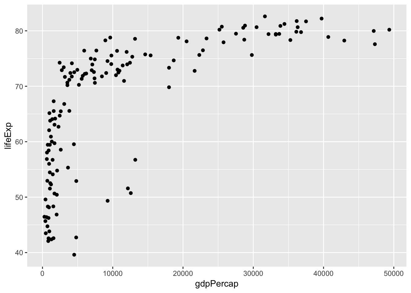
other aesthetics
그래픽 요소(color, size)에 데이터를 매핑
p + geom_point(aes(color = continent, size=pop)) 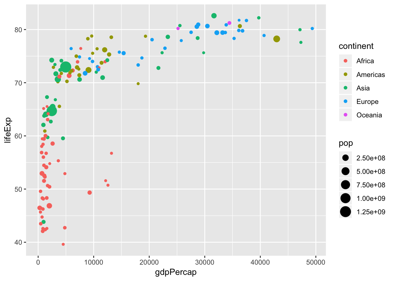
facet
p + geom_point() + facet_grid(.~continent)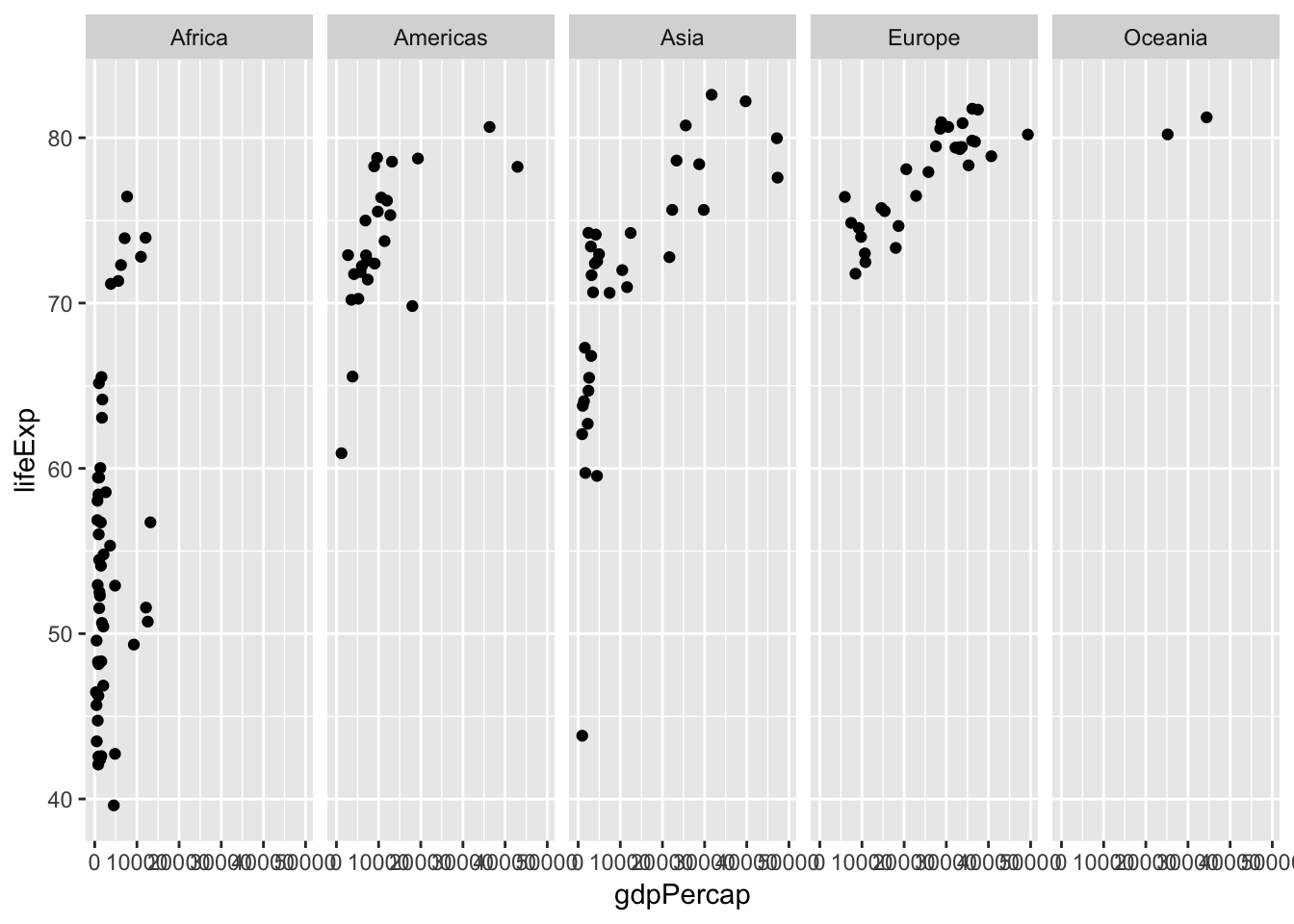
line plot
geom_line 함수를 사용해서, 대륙별로 평균 기대수명의 연도에 따른 변화를 살펴봅시다.
year_continent = gapminder %>%
  group_by(continent, year) %>%
  summarize(meanLifeExp = mean(lifeExp))
p = ggplot(data = year_continent, aes(x=year, y=meanLifeExp, color=continent))
p + geom_line()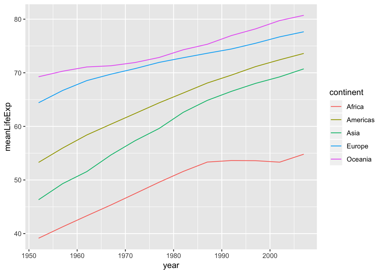
scale
2007년 1인당 국민소득과 기대 수명의 관계를 산점도로 그리고, x축을 로그 변환해봅시다.
p <- ggplot(gapminder_2007, aes(gdpPercap, lifeExp)) + geom_point()
p + scale_x_log10()# scale 함수 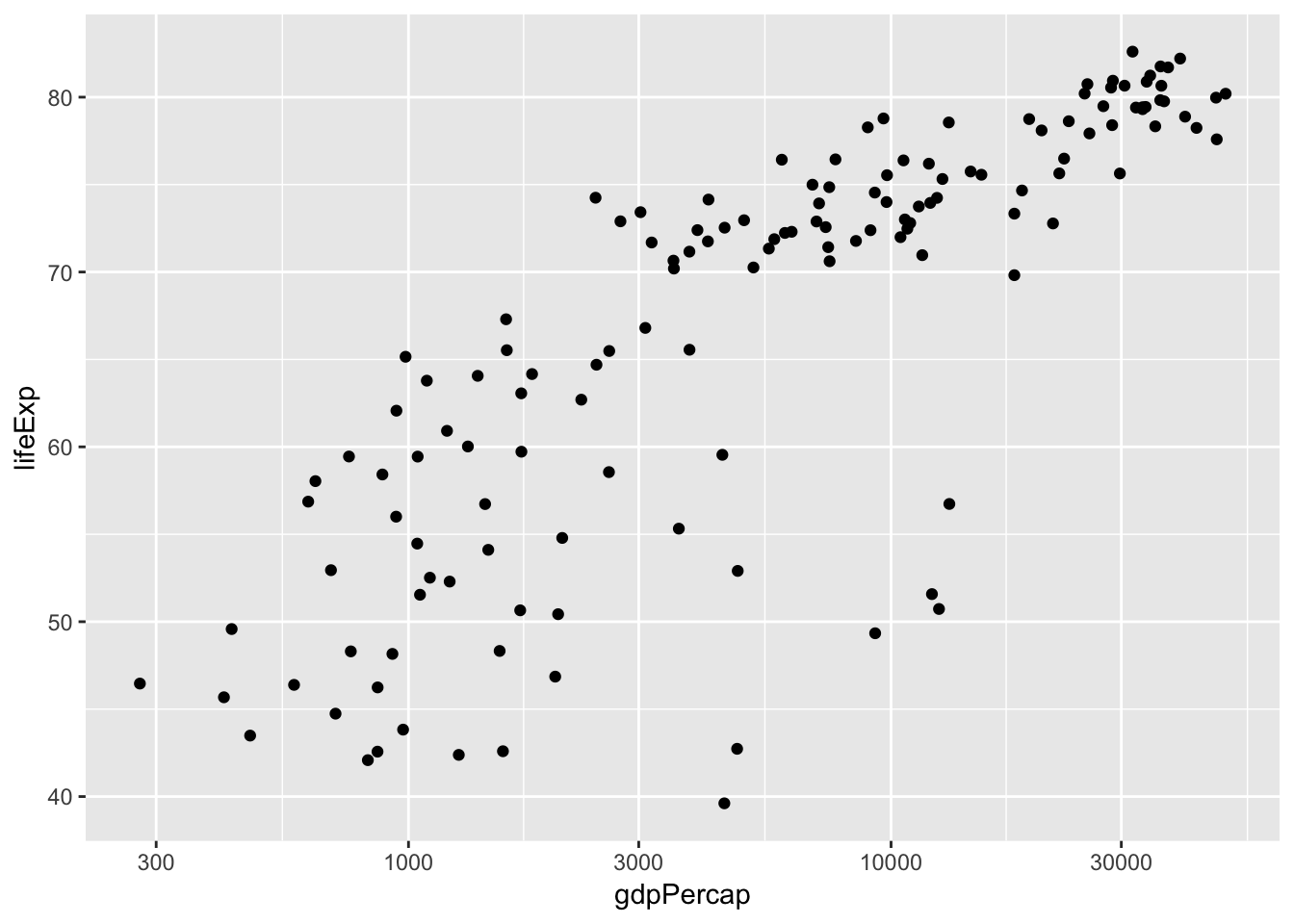
stat
통계적 데이터 변환 함수를 이용해(stat_) 선형회귀직선을 추가해봅시다.
p +scale_x_log10() + stat_smooth(method = "lm", se=F, color = "red") 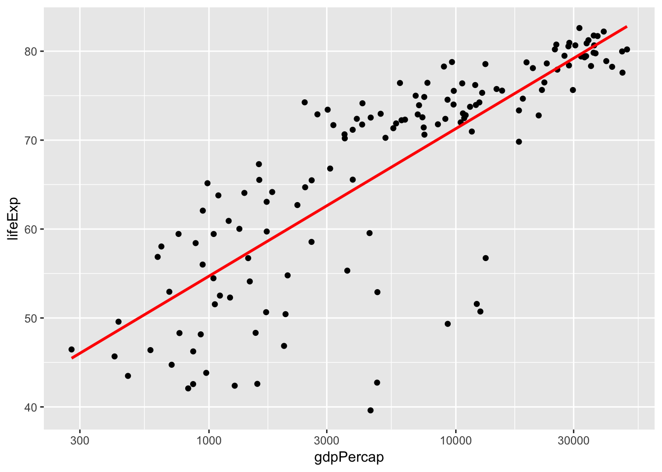
bar plot
대륙별 국가 수를 bar plot으로 그려봅시다.
gapminder %>%
  select(continent, country) %>%
  distinct() %>%
  group_by(continent) %>%
  summarize(n = n()) -> gapminder_temp1
ggplot(gapminder_temp1, aes(continent, n)) + geom_col()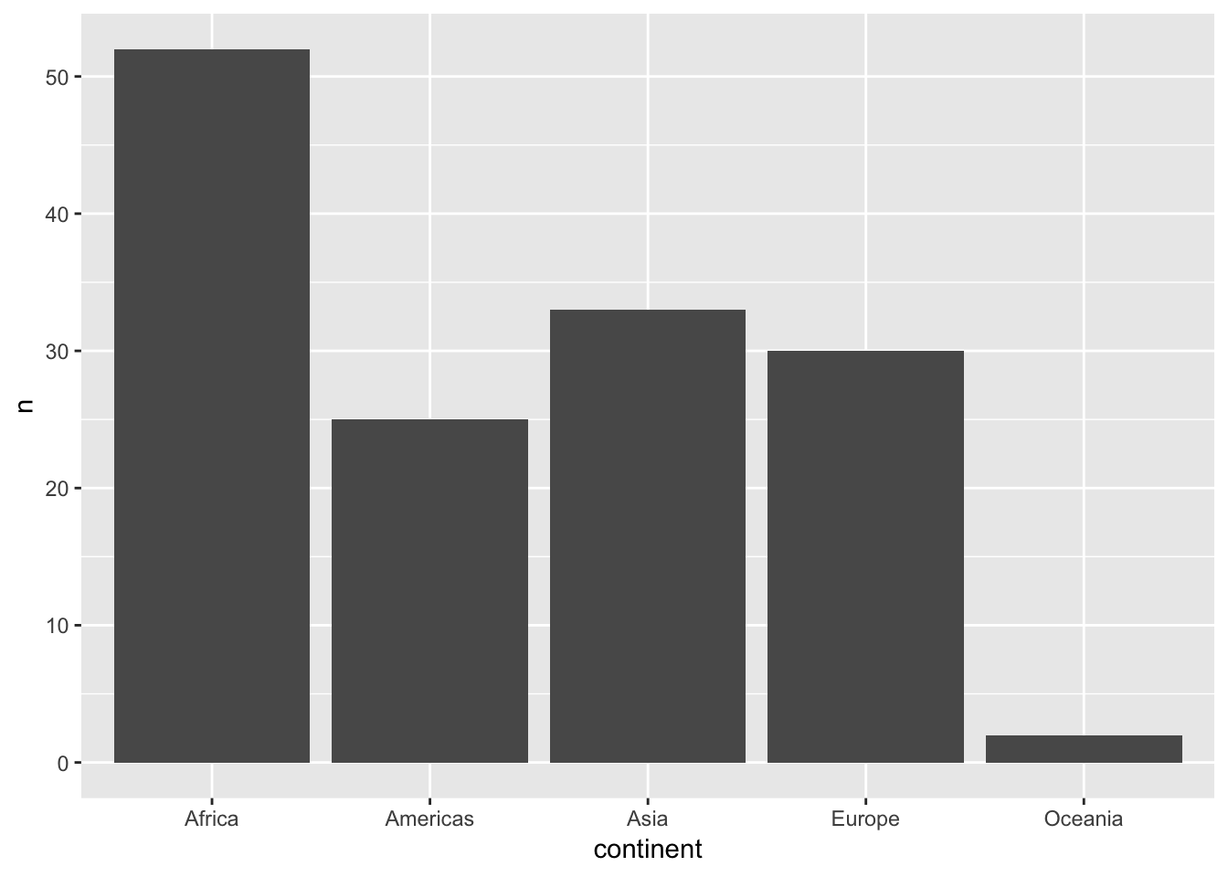
gapminder %>%
  select(continent, country) %>%
  distinct() -> gapminder_temp2
ggplot(gapminder_temp2, aes(continent)) + geom_bar()
[Challenges]
1. 위 bar graph에서 대륙별로 bar의 색깔을 다르게 표현해보세요.
- x-y 좌표축을 flip 해보세요.
histogram
기대수명의 분포를 살펴봅시다(histogram).
ggplot(gapminder, aes(x=lifeExp)) + geom_histogram()
## `stat_bin()` using `bins = 30`. Pick better value with `binwidth`.
ggplot(gapminder, aes(x=lifeExp)) + stat_bin()
## `stat_bin()` using `bins = 30`. Pick better value with `binwidth`.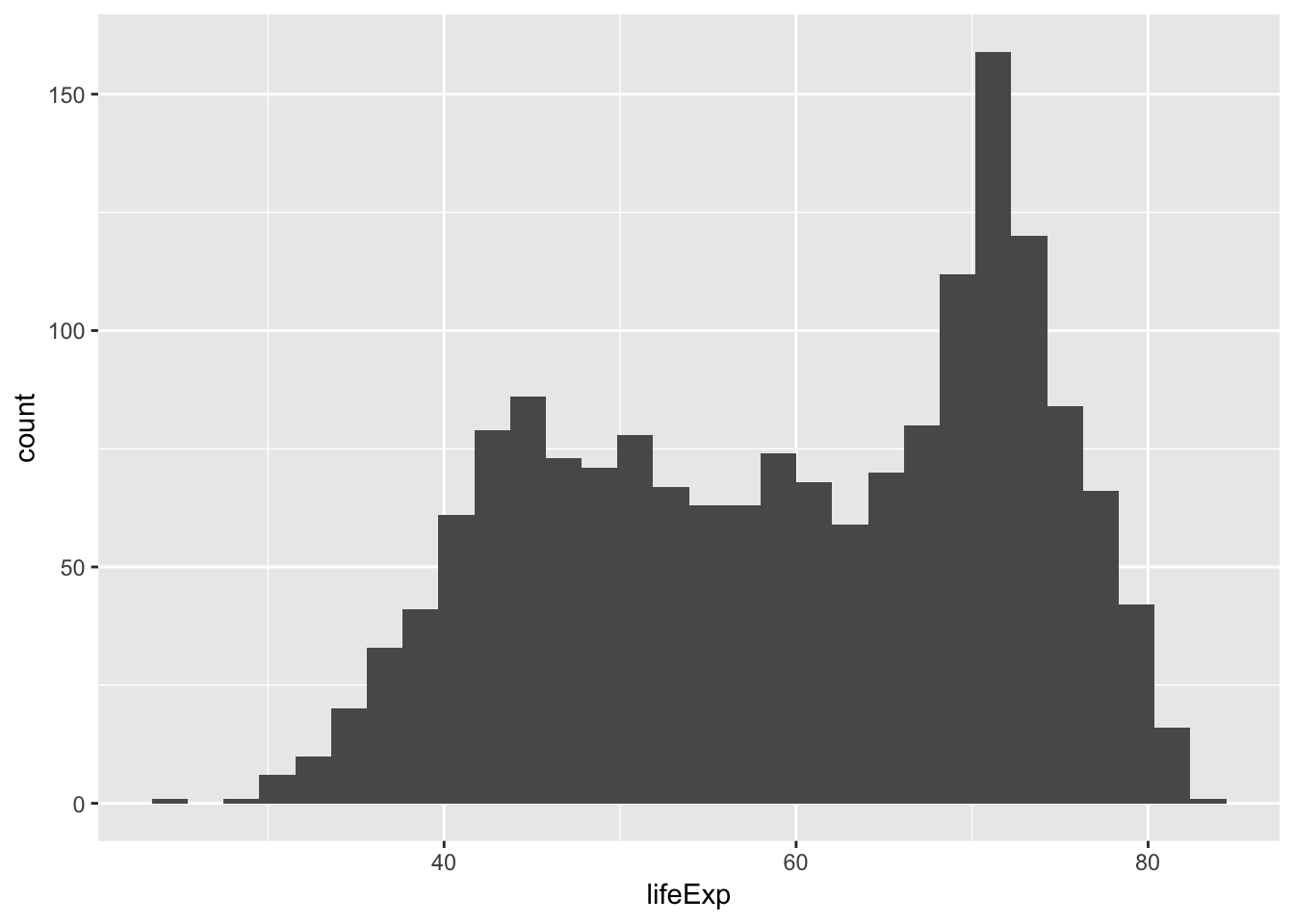
5년 단위 구간(bins)으로 보고 싶으면 binwidth를 설정합니다.
ggplot(gapminder, aes(x=lifeExp)) + geom_histogram(binwidth = 5)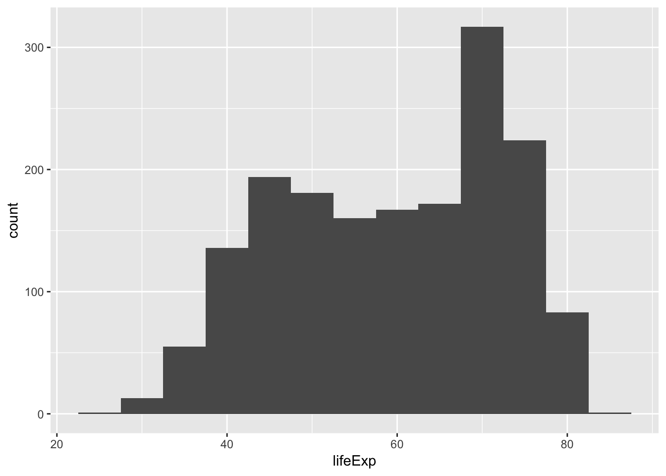
box plot
대륙별 기대수명의 분포를 비교해봅시다(box plot).
p = ggplot(gapminder, aes(x=continent, y=lifeExp))
p + geom_boxplot()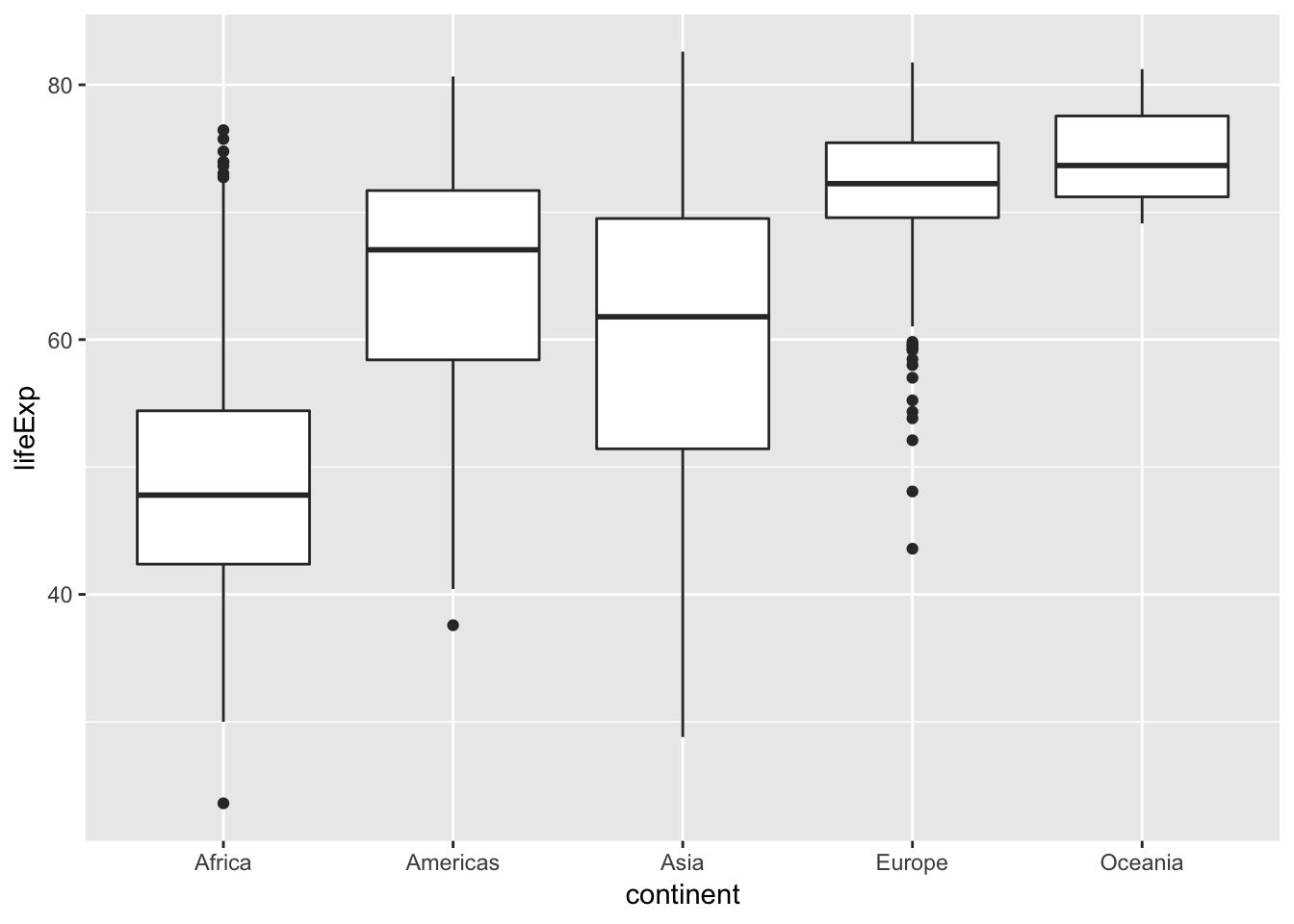
[Challenges]
box plot은 유용하지만 한가지 단점이 있습니다. 데이터 분포의 모양을 알 수 없다는 것이지요. 1. 위 box plot에 데이터 점을 표시해봅시다.
p + geom_boxplot() + geom_jitter(col="orange", alpha=0.5)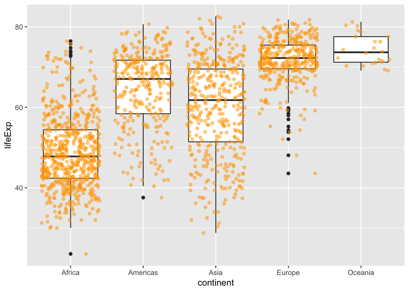
Europe과 Oceania의 차이가 보이시나요?
2. 위 box plot 대신에 violin plot을 그려봅시다. geom_violin()
p + geom_violin()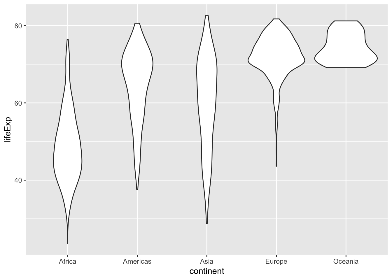
themes
ggplot2에는 시각화의 모양을 빠르게 변경하는데 유용한 몇 가지 다른 테마가 있습니다. 예를 들어 theme_bw() 함수는 배경을 white color로 변경합니다.
p + geom_boxplot() + theme_bw()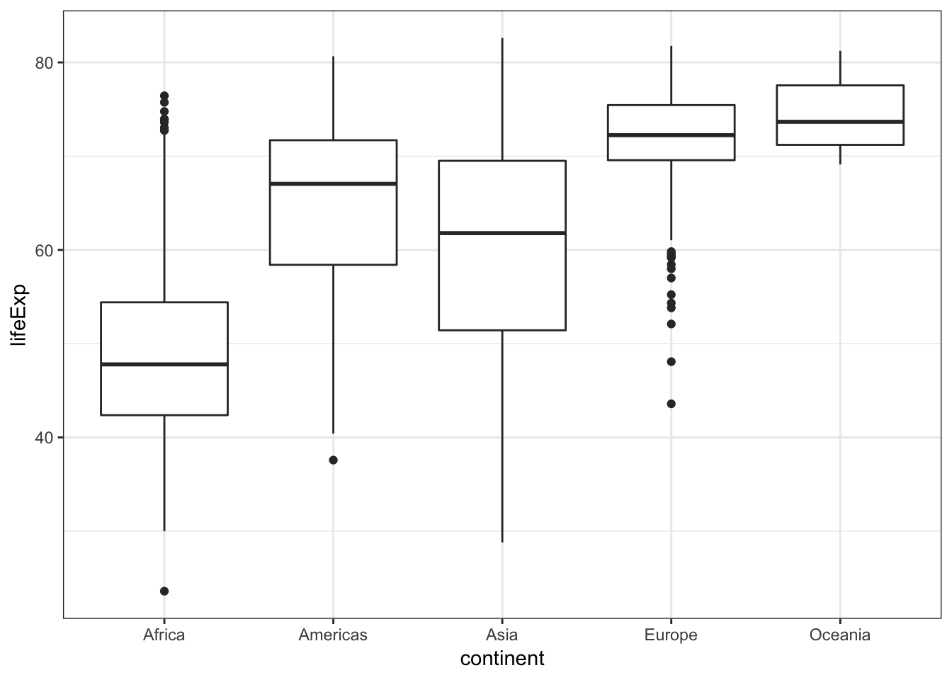
customization
ggplot2를 이용하면 원하는대로 쉽게 그래프를 사용자 정의할 수 있습니다. 예를 들어, 그래프에 제목을 달고, 축의 레이블을 변경해보겠습니다.
p = p + geom_boxplot() +
  labs(title = "Distribution of life expectancy across different continents", x = "Continent", y = "Life expectance (years)")
p 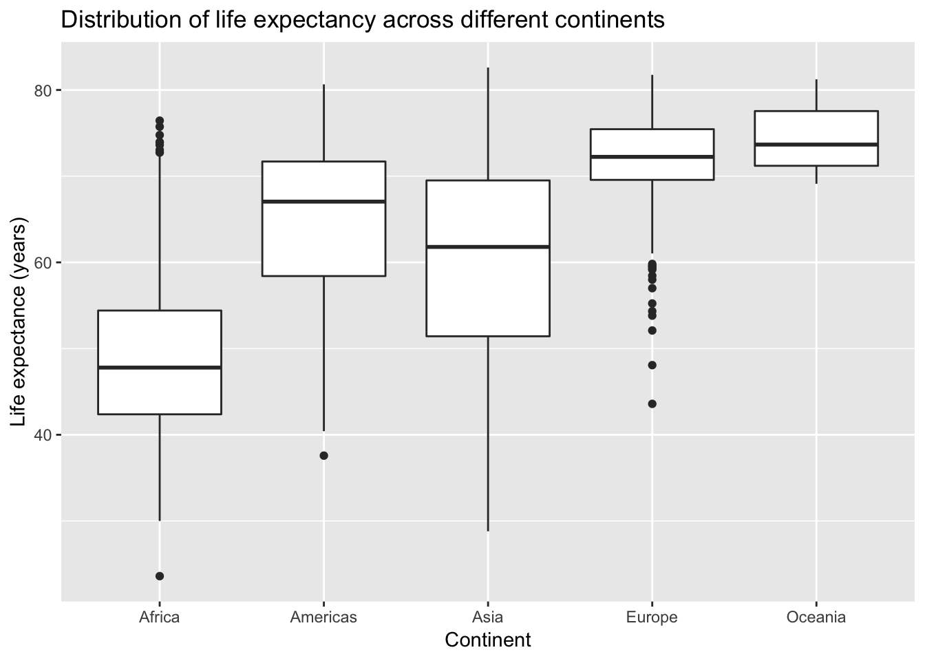
제목과 축의 레이블의 크기를 늘려서 가독성을 향상시켜보겠습니다.
p + theme(text = element_text(size = 16))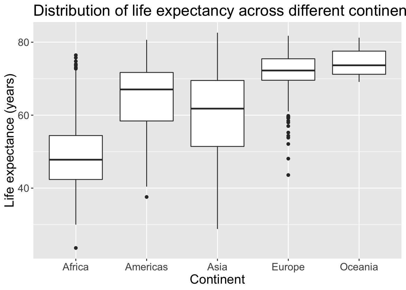
ggplot2 plot 의 기본 성분과 구조
ggplot2 plot의 기본 성분
- Data: 주로 data frame 형태의 데이터 (data)
- Aesthetics: 데이터를 축, 색상, 점의 크기 등으로 매핑 (mapping) - Geometric objects: 점, 선, 도형과 같은 기하학적 객체
- Scales: 데이터의 스케일(x축, y축, 점의 크기, 투명도 등)을 동적으로 조정하여 어떤 시각적 요소를 사용할 것인가 정의
- Coordinate system: 좌표계
- Facetting: 조건부 플롯을 위해 패널을 분할하여 표현하는 방법 - Statistical transformation: Binning, quantiles, smoothing 등의 통계 변환
- Position adjustment: 위치의 조정
attributes(p)
## $names
## [1] "data"        "layers"      "scales"      "mapping"     "theme"
## [6] "coordinates" "facet"       "plot_env"    "labels"
##
## $class
## [1] "gg"     "ggplot"
ggplot2 plot 의 구조
- ggplot = layers + scales + coordinate system - layers = data + mapping + geom + stat + position
ggplot2 함수군
- Plot creation: ggplot 클래스 객체를 생성하는 함수군
- Geoms: graphic의 geometric (기하학적인 형태)을 지정하는 함수군
- Statistics: 데이터를 통계적인 관점으로 변환하는 함수군
- Scales: 축의 스케일 변환과 라벨, 범례 등을 변경하는 함수군
- Coordinate systems: 좌표계를 설정하는 함수군
- Faceting: 그래픽 facet layout 을 정의하는 함수군
- Position adjustment: geometric 의 위치를 지정하는 함수군
- Others
geom_ 함수에는 어떤 것들이 있는지 살펴봅시다.
apropos("^geom_")
##  [1] "geom_abline"     "geom_area"       "geom_bar"
##  [4] "geom_bin2d"      "geom_blank"      "geom_boxplot"
##  [7] "geom_col"        "geom_contour"    "geom_count"
## [10] "geom_crossbar"   "geom_curve"      "geom_density"
## [13] "geom_density_2d" "geom_density2d"  "geom_dotplot"
## [16] "geom_errorbar"   "geom_errorbarh"  "geom_freqpoly"
## [19] "geom_hex"        "geom_histogram"  "geom_hline"
## [22] "geom_jitter"     "geom_label"      "geom_line"
## [25] "geom_linerange"  "geom_map"        "geom_path"
## [28] "geom_point"      "geom_pointrange" "geom_polygon"
## [31] "geom_qq"         "geom_qq_line"    "geom_quantile"
## [34] "geom_raster"     "geom_rect"       "geom_ribbon"
## [37] "geom_rug"        "geom_segment"    "geom_sf"
## [40] "geom_sf_label"   "geom_sf_text"    "geom_smooth"
## [43] "geom_spoke"      "geom_step"       "geom_text"
## [46] "geom_tile"       "geom_violin"     "geom_vline"
stat_ 함수에는 어떤 것들이 있는지 살펴봅시다.
apropos("^stat_")
##  [1] "stat_bin"            "stat_bin_2d"         "stat_bin_hex"
##  [4] "stat_bin2d"          "stat_binhex"         "stat_boxplot"
##  [7] "stat_contour"        "stat_count"          "stat_density"
## [10] "stat_density_2d"     "stat_density2d"      "stat_ecdf"
## [13] "stat_ellipse"        "stat_function"       "stat_identity"
## [16] "stat_qq"             "stat_qq_line"        "stat_quantile"
## [19] "stat_sf"             "stat_sf_coordinates" "stat_smooth"
## [22] "stat_spoke"          "stat_sum"            "stat_summary"
## [25] "stat_summary_2d"     "stat_summary_bin"    "stat_summary_hex"
## [28] "stat_summary2d" "stat_unique" "stat_ydensity"[실습 문제]
proact_sample.txt 파일을 불러들여서, ALSFRS form 만 골라내고, feature_name이 mouth, hands, trunk, leg, respiratory_R, ALSFRS_R_Total에 해당하는 데이터만 선별해서 데이터셋을 만들어보세요.
위 데이터셋에서 factor 변수의 levels을 살펴보고, 불필요한 범주들을 정리해보세요.
변수의 이름을 다음과 같이 변경합시다. feature_name -> feature, feature_value -> value, feature_delta -> delta. 가능하면 짧은 이름이 좋겠죠. 중복되는 건 없애구요.
위 데이터셋에는 중복된 entry들이 있습니다. Let’s remove duplicate entries in the dataset.
데이터셋에는 subjectID, feature, delta가 모두 같은데, value 값이 다른 논리적으로 있을 수 없는(있어서는 안되는?) entry 들이 있군요. 이들을 제거해봅시다 (include entries that appear only once).
위 데이터셋(long format)을 wide format으로 변환해보세요.
alsfrs_wide를 long format으로 변환해보세요.
임의의 10명의 Subject에 대해서 ALSFRS_R_Total의 시간(delta)에 따른 변화를 그래프로 나타내보세요.
전체 환자에 대해서 ALSFRS_R_Total의 시간(delta)에 따른 변화를 그래프로 나타내보세요.
subject 마다 질환의 진행속도가(ALSFRS_R_Total의 slope) 다른 것 같습니다. 진행속도를 다음과 같이 계산해봅시다.
\[R =(ALSFRS_{last}-ALSFRS_{first})/\delta_{interval}\]
\(R\): Rate of progression
\(ALSFRS_{last}\): ALSFRS_R_Total at last visit
\(ALSFRS_{first}\): ALSFRS_R_Total at first visit
\(\delta_{interval}\): time interval between the first and last visit
- 위에서 계산한 질환의 진행속도의(ALSFRS_R_Total의 slope) 분포를 살펴봅시다.